Driving User Success at SafetyCulture
- Dec 6, 2024
- 6 min read
Updated: Jan 24, 2025
Challenge: SafetyCulture needed a seamless way to improve their highest income-generating feature, aligning it with user needs while maintaining an aggressive timeline.
My Role: As a Senior Product Designer, I collaborated with the PM and Dev Lead, guiding a team of 20 engineers. My focus was on balancing iterative user research and real-time design updates.
Approach:
Research & Testing: Conducted user testing to validate multiple UX/UI experiments and ensure feature updates aligned with user and business expectations.
Stakeholder Engagement: Secured buy-in from the CTO for continuous user research alongside regular feature development.
Design Execution: Delivered high-fidelity designs that seamlessly integrated with the existing design system while enhancing the user experience.
Outcome: These efforts led to an intuitive feature redesign, improving usability and contributing to revenue growth, while the iterative process established a foundation for ongoing experimentation and user feedback integration.
The Template Editor before I arrived:

8 months later:

Below are 2 more videos showing the above UX/UI optimisation for "Template Editor" in more detail.
This video shows:
New UX/UI/ interaction design/ new design system
New side navigation panel, featuring a more intuitive way for the user to know which page of the document they are on (Page 1 and 2 were being confused and conflated by users, according to my research). Also, new drag and drop to rearrange pages.
New hover states and logic
New optimisation of information and visual hierarchy (because my user research showed that users could differentiate between pages, sections and sub-sections)
New "Mobile preview" design to encourage users to see how their checklist would be interacted with by end users.
This video shows:
New sections and sub sections interaction design, UI and UX with hover states, new logic, proper spacing of components and hierarchy of information
New logic and visual design for "nesting" sections and sub sections, in order to help users differentiate and understand between when they were creating a page, section or sub section, and if it was being created in the right order of placement.
So what were our challenges, successes and learnings? Let's dive in...
I thought it would be good to start here: I’m going to show you two quotes which illustrates how I found the challenge presented to me when I began my contract.


Before I joined, Safety Culture discovered through research that users found the template editor difficult to use. This was one of the first areas I reviewed in their user and business documentation.

Additionally, we noticed a massive drop off in the data. As soon as a new user (which made up 92% of all users) would enter the template editor, only 10% of them would come back on day two.
After gathering all data and talking with stakeholders, I felt it was best to start here...

I facilitated a workshop with the team, analysing our competitors, our problem space and evaluating the current Template Editor in order to understand which parts didn’t comply with UX/UI best practices and standards.
But ensuring best UX/UI practices were met required more than just heuristic evaluation. We also needed to study our users' overall expectations of the product. And where those expectations came from.
We needed to know their:
1. Overall goals – What our users want to achieve ultimately - E.g. Building a template with ease in as little time and effort as possible
2. Completion goals – What they expect to have happened after using The Template Editor – E.g. Conducting and Sharing a thorough inspection and report
3. Behavioural goals – What they would do to achieve the goal without using the product at all - E.g. Using spreadsheets and paper.
It's a common fact that people use many competitor products in tandem with our own. Pioneers like Google, Apple and Microsoft set a standard and shaped users' expectations of UX and UI patterns which help them navigate our products without having to re-learn new design patterns.
We aimed to align every step in the template creation journey with UI patterns and products users have used before, so a user could scan, build and finish creating in as little time and mental effort as possible.
So the best method for balancing business and user needs was to begin immediately building quick wins (based on our heuristic analysis) while we started up a new research study. And this is what we built in 6 weeks:
Help tools | Usability Improvements |
|
|
The new onboarding tutorial:

Below:
Simplification of the Response Type Menu
Adding a Help Menu where the users could find the tutorial, chat with support + more:

The simplification of the response type menu required us to dig into our user data to see which response types were most used, so we could move the rest of the long list to be hidden behind a "view all" menu item, removing visual noise and prioritising what users most cared about.
While I designed, prototyped and handed over to the developers to build, I began our user research study.
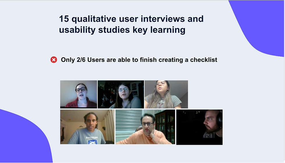
What we wanted to learn was why the Template Editor was so hard to use, and what I found after conducting 15 qualitative user interviews and usability studies, was only 2/6 users could actually finish creating a basic checklist (the simplest form on offer).

So we asked ourselves...
“How might we help users differentiate, discover and easily add Questions, Sections and Pages? Below, you see our many iterations of the design process, from wireframes to current. I want to take this moment to shout out the many product designers from other teams, the data team and my immediate team for having a hand in the decision making when it came to these designs. We did some cool things, like building code just to understand how many levels of nesting users are actually adding to their sections in order to know how to re-think the nesting in the new design.

As this all happened, we felt in the spirit of testing and learning fast, we decided to do a quick and dirty A/B test on top of everything else.
My Product Manager felt concerned about the updates to the system, specifically time and urgency fuelling her concern. After all, this was a $2 billion dollar company with 700 staff and a lot of stakeholders to please. This allowed her to ask, is focussing on 'ease of use' the right direction to take at this time?
So we built a very quick version of the Template Editor that was deliberately and drastically simplified. Allowing the user to switch between Advanced and Simple "mode."
It looked like this:

My gut told me it wouldn't work, because I knew that as soon as users re-entered "advanced mode" (the same old hard to use Template Editor from day one) they would still be lost. Nevertheless, we all felt it was worth a shot.
Hypothesis: A Simple versus Advanced mode will allow users to discover and comprehend the TE UI quicker, ultimately leading to better usability and day 2 retention.
Finally, to close off this portion of the case study, there was one more user study thrown in, which I conducted directly with the CTO that rounded off our chosen areas of focus.
After our initial research findings, the CTO was inspired to conduct what we called the "Unretained Users Study" and the method I suggested was qualitative and quantitative research into why users weren't coming back after day 1…
Research method:
Interviewing users
Surveying users (200-300)
Goal: understand attitudinal and behavioural patterns from users who use the TE, click 40+ times, and don’t return after day 2.
Here's the two of us interviewing a user:

User insights, test results and learnings
To recap, in 8 months, we produced:
Two separate user research studies with 21 user interviews
A quantitative survey of 300 users
10 prototyped, iterated and tested design updates labelled as "quick wins" A fully built new design to A/B test
A brand new design system UI update applied to the editor in tandem with all the above.
All touched by multiple stakeholders; from CTO to Design Managers, to Product Designers and Data Scientists.
Test results:
I shared the outcome of the first user study - which was a clear message: the Template Editor is hard to use and was blocking 3/6 users from completing the build of a template and causing them to churn
The second research study with the CTO revealed a lot: Safety Culture had many tens of industries using the Template Editor, all with their own needs and hierarchy of managerial red tape. Building templates was a cog in the overall user task which was to be able to conduct safety and compliance checks in their respective fields. One thing that was clear in all the learnings was that the old Template Editor was hard to use for new users and required change.
We analysed Google analytics and events closely as we added new features, seeing over time an increase in templates being completed - with more time being required to know and pin point the exact parts that really made a difference.
The brand new look and feel contributed greatly to launching Safety Culture into modern tech and its earned valuation of $2 billion.
Leaving the team
I left the team at the end of my contract proud of the sheer volume of work achieved, the upgrades that would shift Safety Culture usability into a positive response and the invaluable learnings that were now shaping product's most used feature.