Driving Conversions for CBHS Health Insurance
- Jan 23, 2025
- 4 min read

Challenge: CBHS Health Insurance was experiencing low membership sign-up rates, with users dropping off before reaching critical product recommendation and quote pages. The goal was to optimize the customer journey across devices, ensuring a seamless and engaging experience that increased conversions and ultimately boosted memberships.
My Role: Consulting as Senior Product Designer at Sitback Solutions, I led the redesign and optimisation efforts across key touch points in the user journey.
Approach:
Revisiting page designs, processes, workflows, widgets and logic to align with conversion best practices.
Conducting user data analysis to inform design iterations.
Optimising the interface for mobile and desktop experiences.
Implementing interactive elements to guide users toward product recommendations and the quote process.
Changing and adding logic within UI and workflows for better conversion
Outcome: The redesign and optimisation efforts led to significant improvements across key performance metrics:
Internet Sales Growth: Join online and drop-off sales increased steadily: +6% in July, +50% in August, and +25% in September. This growth coincided with enhanced marketing awareness efforts, amplified by the new designs.
Product Page to Product Recommendation Conversion: Click-through rates from product pages to product recommendations grew by 44% in Q1 FY23 compared to the same period last year, or 28% compared to the previous three months.
Conversion Impact: The number of users who visited a product page and converted was significantly higher, indicating that the redesign effectively guided users through the decision-making process.
CBHS before and after I arrived:

So what were our challenges, successes and learnings? Let's dive in...
I was consulting with an agency when I picked up this project, working closely with the Head of Marketing at the time, Jason. Together, with help from my manager and a few of Jason's team, we met every few days to workshop, iterate or execute on decisions we believed would boost conversion and reduce drop off rates throughout the entire customer journey: choosing and exploring products > receiving product recommendations > subscription and payment.
Areas we re-designed for both desktop and mobile: Global Navigation + logic Home page + process
Products page + process Product recommendations page + process
Product details page + process JOL designs + process Returning user logic New user logic Widgets + logic
Information architecture
New forms + logic (Eligibility, Quick Quote, Request a Callback and Refer a Friend)
Landing pages + logic ('Blitz campaign', Exclusive, Refer a Friend)
After gathering all data and talking with stakeholders, I felt it was best to start here...

I led a workshop with Jason's team and mine to analyze competitors, examine our problem space, and assess the current product experience.
Our goal: was to identify areas that didn't align with UX/UI best practices and standards. Given our time constraints, we couldn't conduct user testing before development. Therefore, the most suitable approach, considering our time, budget, and team size, was to rely on our heuristic expertise.
Over a few short months: we workshopped and iterated UX processes, logic, concepts, ideas and UI interactions, modernisation, innovation, colours and imagery:

Final designs below:
Below is a snapshot of the new Homepage and its variations:
When it came to the "scary" information that users often feel is hard to digest, we wanted to make a difference to ease of use. We spent a lot of time re-categorising, organising and labelling information, like the "Extras" list(s), while maintaining compliance with legal requirements.

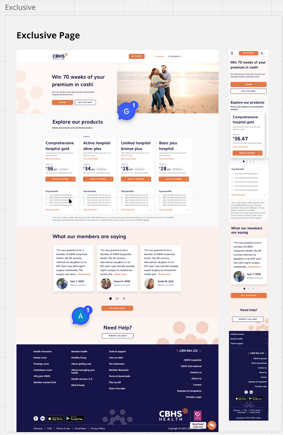
Below, new Exclusive Page, all devices:
Prioritising customer value proposition and products above the fold, allowing users to know exactly which problem of theirs is being solved, info that's important to them (costs, reviews, simplified information), and what to do next.
Below snapshot of some new logic added across the user flow:
We asked ourselves, how might we: allow for user to clearly see when a marketing offer is online and how to apply that offer/see it applied to their chosen super plans. Solution: Mapping out the flow and implementing global colours, tags and notifications that stayed consistent in the UI which allowed users to understand how and where to apply their chosen marketing offers. In this case it was the yellow that remained as the stand out notification colour, which we then ensured showed up in other parts of the journey, calling back to the offer.

Below new navigation for different parts of the funnel/website:
We optimised the funnel to essentially remove unnecessary links and menus as the user ventured further down the funnel. We changed interaction design (like when a user scrolls and the nav decreases in size), and applied a new hierarchy to the information and colour scheme, allowing the user to see clearly the primary and secondary actions afforded to their point in the journey.

Below, Quick Quote:
A snapshot of the Quick Quote form designed for four customer types, each with their own set of questions and corresponding product recommendation.

Below, Blitz Campaign Page and Call me Back Form:

Successes
I left the agency close to the end of the project, and kept in touch with Jason who was able to report a great success in the efforts we managed over a short period of time. We were able to help take the confusion and fear out of users' choices through the simplification of their comparison process and supporting them with a better systemised and stepped process. 2022 success analytics: Internet Sales Growth: Join online and drop-off sales increased steadily: +6% in July, +50% in August, and +25% in September. This growth coincided with enhanced marketing awareness efforts, amplified by the new designs.
Product Page to Product Recommendation Conversion: Click-through rates from product pages to product recommendations grew by 44% in Q1 FY23 compared to the same period last year, or 28% compared to the previous three months.
Conversion Impact: The number of users who visited a product page and converted was significantly higher, indicating that the redesign effectively guided users through the decision-making process.